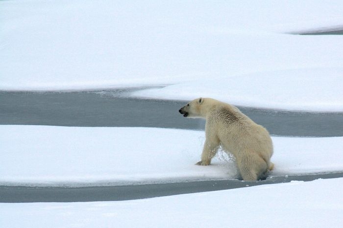
One should be mindful of the effect of images when selecting illustrations for any climate change related communications, write Stacy Rebich-Hespanha and Ronald E. Rice, both of University of California. The authors point out potential issues relating to the 15 most prominent visual frames used in climate change news by US newspapers. They also propose a process model for deliberating on a suitable visual frame.
According to earlier studies, politics is the visual frame most commonly associated with climate change news. This, however, can be counterproductive, the authors warn: politicians (and politics in general) may evoke hostility in the reader – even if the feelings would originally be targeted towards a particular politician.
Rather than prescribing the use of particular frames, the authors emphasize the need to clearly recognize the desired outcome of the communication prior to deciding upon an illustration. A crucial distinction to be made in Rebich-Hespanha’s and Rice’s model is between wanting to encourage novel thinking, or wanting to remind the readers of pre-existing knowledge and attitudes. For the latter effect an illustrator should choose a dominant visual frame (e.g. a polar bear), and “alternative” frames for the former effect.
The article “Dominant Visual Frames in Climate Change News Stories” was published by the International Journal of Communication. It is freely available online (open access).
Picture: Untitled by skeeze, licence CC0 1.0.


